3DVisualizr for ThingWorx
Last updated: March 8, 2021
Prerequisites/Dependencies
| Name | Version |
|---|---|
| ThingWorx | 7.4.0 |
Current Version
| Name | Filename | Version |
|---|---|---|
| Elisa3DViewerCore_ExtensionPackage | Elisa3DViewerRelease.zip | 4.0.25 |
| Elisa3DViewerModel_ExtensionPackage | Elisa3DViewerModel.zip | 1.0.13 |
Introduction and Installation
The 3d viewer is designed to view and visualise factory data in a 3d format by connecting data sources to virtual assets. Virtual assets can display their state, by changing their colour based on some predefined rules, and kpis in a label that can be attached to each individual asset.
| Step | Screenshot(s) |
|---|---|
| After logging into the Composer as Administrator, click on the Import/Export button and click on the Import option at the top. From the opened popup, select Extension as the Import Option from the dropdown menu. |   |
| Click Browse and select the extension Elisa3DViewerRelease.zip. You can click Validate to make sure everything's right with the extension and that Thingworx can actually import it. |  |
| After validating the extension, click on the green Import button and wait for the extension to install. The installation might take a while as the extension ships with an example BABYLON file located at .../Elisa3DViewerCore_ExtensionPackage/ui/Elisa3DViewer/models/PTC_Robot.babylon |  |
At this point, if you want, you can also install the extension called Elisa3DViewerModel_ExtensionPackage that ships in the same download. The model extension contains useful DataShapes, ThingShapes and an example Thing and a Mashup showcasing how to use the viewer to get you up to speed quickly. Using/installing this extension is completely optional and the 3d viewer core can be used without having the model extension installed.
We'll be using the Mashup provided in the model extension as an example within this documentation
| Step | Screenshot(s) |
|---|---|
| To install the model extension, follow the procedures above but when browsing for the extension to install, select the Elisa3DViewerModel.zip instead |  |
| You can verify that everything installed as expected by taking a look at the contents of each package. | |
| Contents of Elisa3DViewerCore_ExtensionPackage |  |
| Contents of Elisa3DViewerModel_ExtensionPackage |  |
Properties
Property definitions
The following is a list of ALL properties within the 3d viewer showing their Description, Base types and Default values. Table(s) of additional property attributes can be found later in the document.
| Name | Description | Base type | Default value |
|---|---|---|---|
| BoneData | Bone data array as infotable | INFOTABLE | 0 |
| BoneDataModelIdField | DESCRIPTION MISSING | FIELDNAME | objectId |
| BoneRotationsField | Bone rotations used to animate/rotate bones in a skeleton mesh | FIELDNAME | boneRotations |
| AnimationState | Mesh animation state as infotable | INFOTABLE | 0 |
| AnimationStateModelIdField | Field name to get the mesh id from | FIELDNAME | meshId |
| AnimationStateTargetFrameField | Field name to get the target (frame) from | FIELDNAME | animationTarget |
| AnimationStatePlayField | Field name to get the whether to play the animation or jump to target from | FIELDNAME | animationPlay |
| AnimationStateLoopField | Field name to get whether to loop the animation from | FIELDNAME | animationLoop |
| AnimationStateDirectionField | Field name to get animation direction from | FIELDNAME | animationDirection |
| AnnotationData | Annotation data array as infotable | INFOTABLE | 0 |
| AnnotationColorField | Field name that defines the color of the annotation | FIELDNAME | |
| AnnotationIconField | Field name that defines the icon of the annotation | FIELDNAME | |
| AnnotationIdField | Field name that defines the id of the annotation | FIELDNAME | |
| AnnotationMeshIdField | Field name that defines the mesh id that the annotation will create and bind to | FIELDNAME | |
| AnnotationPositionField | Field name that defines the position of the annotation | FIELDNAME | |
| CameraFollowObjects | If set to true, camera will follow moving objects (dynamic objects) | BOOLEAN | ⬜ |
| CameraFollowRotation | If set to true, camera will act as if it was parented to the moving object. This value depends on CameraFollowObjects | BOOLEAN | ⬜ |
| CameraDefaultPosition | Default camera position, gets updated when UpdateCameraDefaultTransform is called | VEC3 | 500,500,500 |
| CameraDefaultTargetPosition | Default camera target position, gets updated when UpdateCameraDefaultTransform is called | VEC3 | 0,0,0 |
| CameraRelativePosition | Current camera position relative to target position, gets updated when CameraTransformUpdated is called | VEC3 | 500,500,500 |
| CameraRelativeTargetPosition | Current camera orbit/lookat position, gets updated when CameraTransformUpdated is called | VEC3 | 0,0,0 |
| CameraPath | Camera path animation in .JSON format, gets updated when CameraPathUpdated is called | STRING | [] |
| CameraPathSpeed | Camera path animation speed in units per second | NUMBER | 200 |
| CameraPanningSensitivity | Camera panning sensitivity, bigger value will make the camera pan faster | NUMBER | 0.5 |
| CameraAngularSensitivity | Camera angular sensitivity, smaller value will make the camera turn faster | NUMBER | 500 |
| CameraMinimumRadius | Minimum radius/distance from the focus point. Used for arc ball rotate camera (default camera). Set to <0 for no limit | NUMBER | 1 |
| CameraMaximumRadius | Maximum radius/distance from the focus point. Used for arc ball rotate camera (default camera). Set to <0 for no limit | NUMBER | -1 |
| Camera2D | Whether to use a "2d"/panning only camera (rotations disabled) | BOOLEAN | ⬜ |
| Camera2DAutoDistanceScale | 2d camera auto transition to scene overview distance scale | NUMBER | 1.25 |
| Camera2DMinDistanceToZeroLevel | 2d camera minimum distance to "0-level" | NUMBER | 100 |
| Width | Widget width | INTEGER | 640 |
| Height | Widget height | INTEGER | 480 |
| CanvasRenderingWidth | Maximum rendering canvas width. Needs LimitCanvasSize to be set to true. NOTE: The canvas will still be stretched to fit the space, reducing this will only affect the internal render size which can improve performance for the cost of quality. | INTEGER | 1920 |
| CanvasRenderingHeight | Maximum rendering canvas height. Needs LimitCanvasSize to be set to true. NOTE: The canvas will still be stretched to fit the space, reducing this will only affect the internal render size which can improve performance for the cost of quality. | INTEGER | 1080 |
| LimitCanvasSize | When true, the rendering canvas width and height will be limited according to configuration. | BOOLEAN | ⬜ |
| MaxFPS | Maximum rendered frames per second | INTEGER | 144 |
| ShowPerformanceTimings | Show rendering related timings | BOOLEAN | ⬜ |
| ShowInspector | Show scene inspector | BOOLEAN | ⬜ |
| ConstantlyUpdateViewer | Force update viewer even if nothing's happening. NOTE: Use with care | BOOLEAN | ⬜ |
| DebugMode | Enable debug features and extra logging | BOOLEAN | ⬜ |
| EnableOfflineSupport | Enable offline support, e.g. 3d model caching using client browser cache (.manifest files) | BOOLEAN | ✅ |
| EnableBackgroundGradient | Enable background gradient | BOOLEAN | ✅ |
| UseOctree | Should octree be enabled for a scene | BOOLEAN | ⬜ |
| OctreeCapacity | Octree leaf capacity (meshes) | INTEGER | 8 |
| OctreeDepth | Octree maximum depth (sub-levels) | INTEGER | 4 |
| DebugVisualiseOctree | Debug visualise the generated octree | BOOLEAN | ⬜ |
| AutoMergeMeshesWithSimilarName | EXPERIMENTAL. Use with caution. Automatically merge meshes with similar name (xxx_y) only diffentiated by an index (e.g. table_1 and table_2) | BOOLEAN | ⬜ |
| ParticleTrailStyle | The style of the particle trail. Opacity is supported | STYLEDEFINITION | Elisa3DViewer.Style.ParticleTrail |
| ParticleTrailSize | Size of particles | INTEGER | 16 |
| ShowOnlySelectedGroup | Shows only the selected group | BOOLEAN | ✅ |
| IsPickableDefaultValue | Are objects pickable by default. | BOOLEAN | ✅ |
| AttachedLabelsDefinePickables | If set to true, only objects with attached labels will be pickable. | BOOLEAN | ⬜ |
| TriggerObjectHoveredEvents | Should object hovered events be triggered | BOOLEAN | ⬜ |
| TriggerObjectClickedEvents | Should object clicked events be triggered | BOOLEAN | ⬜ |
| DynamicObjectData | Dynamic object data array as infotable, each entry adds a 3D-object to the active scene | INFOTABLE | 0 |
| DynamicObjectIdField | Field which will provide the unique id (name) for dynamic object, this field should match objectName-field in other infotables | FIELDNAME | DynamicObjId |
| DynamicObjectModelIdField | Field which will provide the unique id (name) for model | FIELDNAME | DynamicObjModelId |
| DynamicObjectPositionField | Field which will provide the position for dynamic object | FIELDNAME | DynamicObjPos |
| DynamicObjectGeoLocationField | Field which will provide the geo location for dynamic object | FIELDNAME | DynamicObjGeoLoca |
| DynamicObjectUnitScale | Unit scale used in dynamic object positioning, all position values are multiplied by this value | VEC3 | 1,1,1 |
| DynamicObjectUnitOffset | Unit offset used in dynamic object positioning, this value is added to all position values after scaling | VEC3 | 0,0,0 |
| DynamicObjectIsGeoLocated | Whether position for a dynamic object is given as geo coordinates | BOOLEAN | ⬜ |
| DynamicObjectGhostEnabled | Enable ghost / object trail. NOT WORKING PROPERLY | BOOLEAN | ✅ |
| GeoData | Infotable containing the data for geo reference markers | INFOTABLE | null |
| GeoRefMarkersField | Field which defines the coordinate of a reference marker | FIELDNAME | referenceMarkers |
| GeoRefMarkerCoordinateField | Field which defines the coordinate of a reference marker | STRING | coordinate |
| GeoRefMarkerScenePosField | Field which defines the scene position of a reference marker | STRING | scenePosition |
| GeoFencesField | Field which defines the coordinate of a reference marker | FIELDNAME | fences |
| GeoFenceNameField | Field which defines the name of a geo fence | STRING | name |
| GeoFenceColourField | Field which defines the colour of a geo fence | STRING | colour |
| GeoFenceCoordinatesField | Field which defines an infotable containing coordinates of a geo fence (of LOCATION baseType) | STRING | coordinates |
| SceneUnitScale | How scene units correspond to real-world units | NUMBER | 2 |
| SortByKPIType | Sort KPIs in a label by their type | BOOLEAN | ⬜ |
| KpiData | KPI data infotable. NOTE: This is only used to determine the id's of the fields below. The actual data input is not used directly but loaded within the label data instead. | INFOTABLE | 0 |
| KpiIdField | KPI id field | FIELDNAME | id |
| KpiTitleField | KPI title field | FIELDNAME | title |
| KpiValueField | KPI value field, NOTE: the string will be interpreted as a number if needed | FIELDNAME | value |
| KpiTypeField | KPI type field. Current types: 0: CUSTOM_INFO - No value field specified, just title shown 1: DEFAULT - Default field with title and value 2: PROGRESS - Progress bar, requires the following additional data: min, max 3: SPEEDOMETER - Speedometer, requires the following additional data: min, max, limit 4: SPEEDBAR - Speedbar, requires the following additional data: min, max, limit | FIELDNAME | type |
| KpiMinField | KPI minimum value field (not used for all types) | FIELDNAME | min |
| KpiMaxField | KPI maximum value field (not used for all types) | FIELDNAME | max |
| KpiLimitField | KPI value limit field, also works as the upper limit for fields with lower limit (not used for all types) | FIELDNAME | limit |
| KpiLowerLimitField | KPI value lower limit field (not used for all types) | FIELDNAME | lowerLimit |
| KpiInvertedField | Whether the "data" is inverted or not. Currently only affecting speedometer; if set to true anything below the limit will be considered to be in a bad range. | FIELDNAME | inverted |
| KpiFontColourField | Which style definition field to use for colouring the kpi text/value | STRING | |
| KpiStyleStateFormatting | Optional rules for dynamic formatting of KPIs, first state is the least important | STATEFORMATTING | undefined |
| LabelData | Label data array as infotable | INFOTABLE | 0 |
| LabelIdField | Field which will provide the id for the label. this has to be unique. | FIELDNAME | id |
| LabelTitleField | Field which will provide the displayed label title, supports linebreaks with "\n" and "<br>" | FIELDNAME | title |
| LabelCollapsedTitleField | Field which will provide the displayed label title when in collapsed (title only) mode, supports linebreaks with "\n" and "<br>" | FIELDNAME | collapsedTitle |
| LabelTextField | Field which will provide the displayed label text, supports linebreaks with "\n" and "<br>" | FIELDNAME | text |
| LabelKPIField | Field which will provide the displayed label kpi infotable | FIELDNAME | kpiData |
| LabelAnimationField | Field which will provide the animation state: - 0: Stopped - 1: Play | FIELDNAME | animationMode |
| LabelTargetObjectField | Field which will provide the name of the 3d-object that the label gets attached to | FIELDNAME | objectId |
| LabelLayoutModeField | Field that determines if the labels default layout mode: - 0: Hidden - 1: Icon only - 2: Icon and title - 3: Everything - 4: Everything, not grouped | FIELDNAME | layoutMode |
| LabelGroupField | Field that determines the group that this label belongs to. Field affects clustering | FIELDNAME | group |
| LabelStyleIconSize | Global label icon size (px) used in label styling | INTEGER | 25 |
| LabelStyleStateFormatting | Optional rules for dynamic formatting of labels and markers, first state is the least important | STATEFORMATTING | undefined |
| LabelStyleHover | The style of the UI elements when hovered. Opacity is supported | STYLEDEFINITION | Elisa3DViewer.Style.Hover |
| LabelStyleSelected | The style of the UI elements when selected. Opacity is supported | STYLEDEFINITION | Elisa3DViewer.Style.Selected |
| SelectedLabelId | The currently selected label id, triggers changed event. HAS TO BE UNIQUE | STRING | |
| SelectedLabelPosition | Position of a label when selected. "Default" leaves the label where it is normally, "Home menu" positions the selected label statically next to home menu. | NUMBER | 0 |
| StateNumberDefinesStylePriority | State formatting value can be a number. If set to true the number will be used as a priority (e.g. high number means higher priority), otherwise priority is based on the order in which the states are defined (default). | BOOLEAN | ⬜ |
| ObjectButtonField | Field from label data which will provide content for the object button next to home menu. NOTE: If nothing's selected, will fallback to object name from the scene file. | FIELDNAME | title |
| ObjectData | Object data array as infotable | INFOTABLE | 0 |
| ObjectIdField | Name of the object (mesh) in scene | FIELDNAME | objectName |
| ObjectCameraPositionField | Camera position used to in object zooming transitions | FIELDNAME | relativePosition |
| ObjectTargetPositionField | Camera target position used to in object zooming transitions | FIELDNAME | relativeTargetPosition |
| ObjectColorIntensity | Object overlay color intensity, "intensity" can be also set with color alpha value | NUMBER | 0.5 |
| SceneName | Usually the name of the factory, used in various non-critical parts of the widget. | STRING | Undefined Scene |
| SceneModelUrl | URL to the model | STRING | |
| SceneModelFileSize | Download size of the model | INTEGER | 0 |
| SceneConfig | Config json to the scene model file | STRING | {} |
| SceneBackgroundStyle | The background of the widget. Opacity is supported | STYLEDEFINITION | Elisa3DViewer.Style.SceneBg |
| ResetSceneOnModelChange | Reset the scene whenever the model changes | BOOLEAN | ✅ |
| DynamicLighting | Use dynamic lighting instead of unlit scene | BOOLEAN | ⬜ |
| GlobalLightIntensity | Used only if dynamic lighting is enabled | NUMBER | 0.75 |
| ActiveLayer | Active mesh layer (-1 means all) | INTEGER | -1 |
| SceneExport | Infotable to which scene mesh data will be exported to when. Input target is only used for getting the data shape and fields for export. | INFOTABLE | 0 |
| SceneExportMeshIdField | Field in which the mesh id will be saved to | FIELDNAME | id |
| SceneExportMeshNameField | Field in which the mesh name will be saved to | FIELDNAME | name |
| SceneExportMeshPositionField | Field in which the mesh position will be saved to | FIELDNAME | position |
| SelectedObjectId | The id currently selected item in the scene, triggers changed event | STRING | |
| SelectedGroupId | The currently selected group in the scene, triggers changed event | STRING | |
| ModelData | Model data array as infotable | INFOTABLE | 0 |
| ModelIdField | Field which will provide the model id | FIELDNAME | name |
| ModelUrlField | Field which will provide model url / filepath | FIELDNAME | url |
| ModelScaleField | Field which will provide the model scale | FIELDNAME | scale |
| LoadingScreenStyle | The style of the loading screen. Opacity is supported | STYLEDEFINITION | Elisa3DViewer.Style.LoadingScreen |
| Routes | Route data in json format | STRING | {} |
| WidgetCapabilities | Capabilities for the 3DV. Recommended to use 15 (BASIC) | INTEGER | 15 |
| EnableAzureInsights | Whether to enable Azure Insights analytics | BOOLEAN | ⬜ |
| AzureTrackEvents | Send event triggers as events to Azure | BOOLEAN | ⬜ |
Property visibilities and data binding capabilities
The following table contains the visibility and data binding capabilities of ALL properties defined by the 3d viewer.
Some of the binding targets may not behave as expected during runtime and will be improved in later updates
| Name | Is visible | Is editable | Is binding target | Is binding source |
|---|---|---|---|---|
| BoneData | ✅ | ✅ | ✅ | ⬜ |
| BoneDataModelIdField | ⬜ | ✅ | ✅ | ⬜ |
| BoneRotationsField | ⬜ | ✅ | ✅ | ⬜ |
| AnimationState | ✅ | ✅ | ✅ | ⬜ |
| AnimationStateModelIdField | ⬜ | ⬜ | ✅ | ⬜ |
| AnimationStateTargetFrameField | ⬜ | ✅ | ✅ | ⬜ |
| AnimationStatePlayField | ⬜ | ✅ | ✅ | ⬜ |
| AnimationStateLoopField | ⬜ | ✅ | ✅ | ⬜ |
| AnimationStateDirectionField | ⬜ | ✅ | ✅ | ⬜ |
| AnnotationData | ✅ | ✅ | ✅ | ✅ |
| AnnotationColorField | ⬜ | ✅ | ✅ | ⬜ |
| AnnotationIconField | ⬜ | ✅ | ✅ | ⬜ |
| AnnotationIdField | ⬜ | ✅ | ✅ | ⬜ |
| AnnotationMeshIdField | ⬜ | ✅ | ✅ | ⬜ |
| AnnotationPositionField | ⬜ | ✅ | ✅ | ⬜ |
| CameraFollowObjects | ✅ | ✅ | ✅ | ⬜ |
| CameraFollowRotation | ✅ | ✅ | ✅ | ⬜ |
| CameraDefaultPosition | ✅ | ✅ | ✅ | ✅ |
| CameraDefaultTargetPosition | ✅ | ✅ | ✅ | ✅ |
| CameraRelativePosition | ✅ | ✅ | ✅ | ✅ |
| CameraRelativeTargetPosition | ✅ | ✅ | ✅ | ✅ |
| CameraPath | ✅ | ✅ | ✅ | ✅ |
| CameraPathSpeed | ✅ | ✅ | ✅ | ✅ |
| CameraPanningSensitivity | ✅ | ✅ | ✅ | ⬜ |
| CameraAngularSensitivity | ✅ | ✅ | ✅ | ⬜ |
| CameraMinimumRadius | ✅ | ✅ | ✅ | ⬜ |
| CameraMaximumRadius | ✅ | ✅ | ✅ | ⬜ |
| Camera2D | ✅ | ✅ | ✅ | ⬜ |
| Camera2DAutoDistanceScale | ✅ | ✅ | ✅ | ⬜ |
| Camera2DMinDistanceToZeroLevel | ✅ | ✅ | ✅ | ⬜ |
| Width | ✅ | ✅ | ⬜ | ⬜ |
| Height | ✅ | ✅ | ⬜ | ⬜ |
| CanvasRenderingWidth | ✅ | ✅ | ⬜ | ⬜ |
| CanvasRenderingHeight | ✅ | ✅ | ⬜ | ⬜ |
| LimitCanvasSize | ✅ | ✅ | ⬜ | ⬜ |
| MaxFPS | ✅ | ✅ | ✅ | ⬜ |
| ShowPerformanceTimings | ✅ | ✅ | ✅ | ⬜ |
| ShowInspector | ✅ | ✅ | ✅ | ⬜ |
| ConstantlyUpdateViewer | ✅ | ✅ | ⬜ | ⬜ |
| DebugMode | ✅ | ✅ | ✅ | ⬜ |
| EnableOfflineSupport | ✅ | ✅ | ✅ | ⬜ |
| EnableBackgroundGradient | ✅ | ✅ | ⬜ | ⬜ |
| UseOctree | ✅ | ✅ | ⬜ | ⬜ |
| OctreeCapacity | ✅ | ✅ | ⬜ | ⬜ |
| OctreeDepth | ✅ | ✅ | ⬜ | ⬜ |
| DebugVisualiseOctree | ⬜ | ⬜ | ⬜ | ⬜ |
| AutoMergeMeshesWithSimilarName | ✅ | ✅ | ⬜ | ⬜ |
| ParticleTrailStyle | ✅ | ✅ | ⬜ | ⬜ |
| ParticleTrailSize | ✅ | ✅ | ✅ | ⬜ |
| ShowOnlySelectedGroup | ✅ | ✅ | ✅ | ⬜ |
| IsPickableDefaultValue | ✅ | ✅ | ✅ | ⬜ |
| AttachedLabelsDefinePickables | ✅ | ✅ | ✅ | ⬜ |
| TriggerObjectHoveredEvents | ✅ | ✅ | ⬜ | ⬜ |
| TriggerObjectClickedEvents | ✅ | ✅ | ⬜ | ⬜ |
| DynamicObjectData | ✅ | ✅ | ✅ | ⬜ |
| DynamicObjectIdField | ⬜ | ✅ | ✅ | ⬜ |
| DynamicObjectModelIdField | ⬜ | ✅ | ✅ | ⬜ |
| DynamicObjectPositionField | ⬜ | ✅ | ✅ | ⬜ |
| DynamicObjectGeoLocationField | ⬜ | ✅ | ✅ | ⬜ |
| DynamicObjectUnitScale | ✅ | ✅ | ✅ | ✅ |
| DynamicObjectUnitOffset | ✅ | ✅ | ✅ | ✅ |
| DynamicObjectIsGeoLocated | ✅ | ✅ | ✅ | ⬜ |
| DynamicObjectGhostEnabled | ⬜ | ✅ | ✅ | ⬜ |
| GeoData | ✅ | ✅ | ✅ | ✅ |
| GeoRefMarkersField | ⬜ | ✅ | ⬜ | ⬜ |
| GeoRefMarkerCoordinateField | ✅ | ✅ | ⬜ | ⬜ |
| GeoRefMarkerScenePosField | ✅ | ✅ | ⬜ | ⬜ |
| GeoFencesField | ⬜ | ✅ | ⬜ | ⬜ |
| GeoFenceNameField | ✅ | ✅ | ⬜ | ⬜ |
| GeoFenceColourField | ✅ | ✅ | ⬜ | ⬜ |
| GeoFenceCoordinatesField | ✅ | ✅ | ⬜ | ⬜ |
| SceneUnitScale | ✅ | ✅ | ⬜ | ⬜ |
| SortByKPIType | ✅ | ✅ | ✅ | ⬜ |
| KpiData | ✅ | ✅ | ✅ | ⬜ |
| KpiIdField | ⬜ | ✅ | ⬜ | ⬜ |
| KpiTitleField | ⬜ | ✅ | ⬜ | ⬜ |
| KpiValueField | ⬜ | ✅ | ⬜ | ⬜ |
| KpiTypeField | ⬜ | ✅ | ⬜ | ⬜ |
| KpiMinField | ⬜ | ✅ | ⬜ | ⬜ |
| KpiMaxField | ⬜ | ✅ | ⬜ | ⬜ |
| KpiLimitField | ⬜ | ✅ | ⬜ | ⬜ |
| KpiLowerLimitField | ⬜ | ✅ | ⬜ | ⬜ |
| KpiInvertedField | ⬜ | ✅ | ⬜ | ⬜ |
| KpiFontColourField | ✅ | ✅ | ⬜ | ⬜ |
| KpiStyleStateFormatting | ✅ | ✅ | ⬜ | ⬜ |
| LabelData | ✅ | ✅ | ✅ | ⬜ |
| LabelIdField | ⬜ | ✅ | ✅ | ⬜ |
| LabelTitleField | ⬜ | ✅ | ✅ | ⬜ |
| LabelCollapsedTitleField | ⬜ | ✅ | ✅ | ⬜ |
| LabelTextField | ⬜ | ✅ | ✅ | ⬜ |
| LabelKPIField | ⬜ | ✅ | ✅ | ⬜ |
| LabelAnimationField | ⬜ | ✅ | ✅ | ⬜ |
| LabelTargetObjectField | ⬜ | ✅ | ✅ | ⬜ |
| LabelLayoutModeField | ⬜ | ✅ | ✅ | ⬜ |
| LabelGroupField | ⬜ | ✅ | ✅ | ⬜ |
| LabelStyleIconSize | ✅ | ✅ | ✅ | ⬜ |
| LabelStyleStateFormatting | ✅ | ✅ | ⬜ | ⬜ |
| LabelStyleHover | ✅ | ✅ | ⬜ | ⬜ |
| LabelStyleSelected | ✅ | ✅ | ⬜ | ⬜ |
| SelectedLabelId | ✅ | ✅ | ✅ | ✅ |
| SelectedLabelPosition | ⬜ | ✅ | ⬜ | ⬜ |
| StateNumberDefinesStylePriority | ✅ | ✅ | ⬜ | ⬜ |
| ObjectButtonField | ⬜ | ✅ | ✅ | ⬜ |
| ObjectData | ✅ | ✅ | ✅ | ⬜ |
| ObjectIdField | ⬜ | ✅ | ✅ | ⬜ |
| ObjectCameraPositionField | ⬜ | ✅ | ✅ | ⬜ |
| ObjectTargetPositionField | ⬜ | ✅ | ✅ | ⬜ |
| ObjectColorIntensity | ✅ | ✅ | ✅ | ✅ |
| SceneName | ✅ | ✅ | ✅ | ⬜ |
| SceneModelUrl | ✅ | ⬜ | ✅ | ⬜ |
| SceneModelFileSize | ✅ | ✅ | ✅ | ⬜ |
| SceneConfig | ✅ | ✅ | ✅ | ⬜ |
| SceneBackgroundStyle | ✅ | ✅ | ⬜ | ⬜ |
| ResetSceneOnModelChange | ✅ | ✅ | ✅ | ⬜ |
| DynamicLighting | ✅ | ✅ | ✅ | ⬜ |
| GlobalLightIntensity | ✅ | ✅ | ✅ | ⬜ |
| ActiveLayer | ⬜ | ✅ | ⬜ | ⬜ |
| SceneExport | ✅ | ✅ | ✅ | ✅ |
| SceneExportMeshIdField | ⬜ | ✅ | ⬜ | ⬜ |
| SceneExportMeshNameField | ⬜ | ✅ | ⬜ | ⬜ |
| SceneExportMeshPositionField | ⬜ | ✅ | ⬜ | ⬜ |
| SelectedObjectId | ✅ | ✅ | ✅ | ✅ |
| SelectedGroupId | ✅ | ✅ | ✅ | ✅ |
| ModelData | ✅ | ✅ | ✅ | ⬜ |
| ModelIdField | ⬜ | ✅ | ✅ | ⬜ |
| ModelUrlField | ⬜ | ✅ | ✅ | ⬜ |
| ModelScaleField | ⬜ | ✅ | ✅ | ⬜ |
| LoadingScreenStyle | ✅ | ✅ | ⬜ | ⬜ |
| Routes | ✅ | ✅ | ✅ | ⬜ |
| EnableAzureInsights | ✅ | ✅ | ⬜ | ⬜ |
| AzureTrackEvents | ✅ | ✅ | ⬜ | ⬜ |
Properties with additional requirements
The following table contains the list of all properties that have some sort of a Base type restriction, Predefined options/value or somehow depend on an Base type infotable property
| Name | Base type restrictions | Source property name | Base type infotable property | Select options |
|---|---|---|---|---|
| BoneDataModelIdField | STRING | BoneData | ||
| BoneRotationsField | STRING | BoneData | ||
| AnimationStateModelIdField | STRING | AnimationState | ||
| AnimationStateTargetFrameField | STRING | AnimationState | ||
| AnimationStatePlayField | STRING | AnimationState | ||
| AnimationStateLoopField | STRING | AnimationState | ||
| AnimationStateDirectionField | STRING | AnimationState | ||
| AnnotationColorField | STRING | AnnotationData | ||
| AnnotationIconField | STRING | AnnotationData | ||
| AnnotationIdField | STRING | AnnotationData | ||
| AnnotationMeshIdField | STRING | AnnotationData | ||
| AnnotationPositionField | VEC3 | AnnotationData | ||
| DynamicObjectIdField | STRING | DynamicObjectData | ||
| DynamicObjectModelIdField | STRING | DynamicObjectData | ||
| DynamicObjectPositionField | VEC3 | DynamicObjectData | ||
| DynamicObjectGeoLocationField | LOCATION | DynamicObjectData | ||
| GeoRefMarkersField | INFOTABLE | GeoData | ||
| GeoRefMarkerCoordinateField | LOCATION | |||
| GeoRefMarkerScenePosField | VEC3 | |||
| GeoFencesField | INFOTABLE | GeoData | ||
| GeoFenceNameField | STRING | |||
| GeoFenceColourField | VEC4 | |||
| GeoFenceCoordinatesField | INFOTABLE | |||
| SceneUnitScale | - Millimeters - Centimeters - Decimeters - Meters - Decameters - Hehtometers - Kilometers | |||
| KpiIdField | STRING | KpiData | ||
| KpiTitleField | STRING | KpiData | ||
| KpiValueField | STRING | KpiData | ||
| KpiTypeField | INTEGER | KpiData | ||
| KpiMinField | NUMBER | KpiData | ||
| KpiMaxField | NUMBER | KpiData | ||
| KpiLimitField | NUMBER | KpiData | ||
| KpiLowerLimitField | NUMBER | KpiData | ||
| KpiInvertedField | BOOLEAN | KpiData | ||
| KpiFontColourField | - Background color - Foreground color - Line color - Secondary background color | |||
| KpiStyleStateFormatting | KpiData | |||
| LabelIdField | STRING | LabelData | ||
| LabelTitleField | STRING | LabelData | ||
| LabelCollapsedTitleField | STRING | LabelData | ||
| LabelTextField | STRING | LabelData | ||
| LabelKPIField | INFOTABLE | LabelData | ||
| LabelAnimationField | INTEGER | LabelData | ||
| LabelTargetObjectField | STRING | LabelData | ||
| LabelLayoutModeField | INTEGER | LabelData | ||
| LabelGroupField | STRING | LabelData | ||
| LabelStyleStateFormatting | LabelData | |||
| SelectedLabelPosition | - Default - Home menu | |||
| ObjectButtonField | STRING | LabelData | ||
| ObjectIdField | STRING | ObjectData | ||
| ObjectCameraPositionField | VEC3 | ObjectData | ||
| ObjectTargetPositionField | VEC3 | ObjectData | ||
| SceneExportMeshIdField | STRING | SceneExport | ||
| SceneExportMeshNameField | STRING | SceneExport | ||
| SceneExportMeshPositionField | VEC3 | SceneExport | ||
| ModelIdField | STRING | ModelData | ||
| ModelUrlField | STRING | ModelData | ||
| ModelScaleField | VEC3 | ModelData |
Triggers
The following table contains a list of all the Service Triggers that you can execute on the viewer
| Name | Description | Warn if not bound |
|---|---|---|
| TransitionCameraOnSelectedObject | If selected object has data bound in the objectData then camera gets transitioned to the values | ⬜ |
| StartPathAnimation | Starts the camera flythrough using the waypoints available in the current scene. Does nothing if no waypoints are present. | ⬜ |
| TransitionCameraToDefault | Transitions camera to the default values (CameraDefaultPosition and CameraDefaultTargetPosition) | ⬜ |
| FocusCameraOnSelectedObject | Turns camera to look at the selected object pivot point | ⬜ |
| UpdatePathAnimation | Serializes path animation points to .JSON and updates CameraPath property and triggers CameraPathUpdated | ⬜ |
| UpdateCameraTransform | Captures current camera transform (position and target that the camera is orbiting) and updates those values and triggers CameraTransformUpdated | ⬜ |
| UpdateCameraDefaultTransform | Captures current camera transform (position and target that the camera is orbiting) and updates those values and triggers CameraDefaultTransformUpdated | ⬜ |
| ExportScene | Export scene mesh data to the INFOTABLE bound to SceneExport | ⬜ |
| DownloadSnapshot | Creates snapshot of all the widget properties and data updates and stores it to a .json file | ⬜ |
Events
The following table contains a list of all events emitted by the viewer during its runtime
| Name | Description | Warn if not bound |
|---|---|---|
| CameraPathUpdated | Triggered after UpdatePathAnimation is completed | ⬜ |
| CameraTransformUpdated | Triggered after UpdateCameraTransform is completed, if an object or group was selected then CameraRelativePosition and CameraRelativeTargetPosition were updated | ⬜ |
| CameraDefaultTransformUpdated | Triggered after UpdateCameraDefaultTransform is completed | ⬜ |
| CameraTransitionStopped | Triggers whenever a transition stops (is cancelled or finishes) | ⬜ |
| CameraTransitionDone | Triggers whenever a transition finishes | ⬜ |
| CameraTransitionToMeshDone | Triggers whenever a transition to a model/object finishes | ⬜ |
| CameraTransitionToHomeDone | Triggers whenever a transition to home finishes | ⬜ |
| GeoDataUpdated | Triggered when geo editor is closed and GeoData is updated. | ⬜ |
| AnnotationDataUpdated | Triggered when the annotation data changed (e.g. users add/move/delete an annotation) | ⬜ |
| LabelClicked | IMPLEMENTATION MISSING | ⬜ |
| LabelHovered | IMPLEMENTATION MISSING | ⬜ |
| ObjectClicked | Triggered when user clicks on an object | ⬜ |
| ObjectHovered | Triggered when user hovers an object | ⬜ |
| SceneExported | Triggered after ExportScene is completed | ⬜ |
| ModelLoadDone | Triggered when model loading is completed | ⬜ |
| ModelLoadError | Triggered if something goes wrong in loading the model | ⬜ |
| MeshLoadDone | Triggered when model loading is completed | ⬜ |
| MeshLoadError | Triggered if something goes wrong in loading the model | ⬜ |
| SelectedLabelChanged | Triggered when selected label changes | ⬜ |
| SelectedObjectChanged | Triggered when selected object (mesh) changes | ⬜ |
| SelectedGroupChanged | Triggered when selected label group changes | ⬜ |
| HomeClicked | Triggered when user clicks the home icon on the menu | ⬜ |
| GroupClicked | Triggered when user clicks the group label on the menu | ⬜ |
| GroupHovered | IMPLEMENTATION MISSING | ⬜ |
Localisation table
The following table is a list of localisation token's and their default values that can be used to localise the messages/texts within the viewer.
| Token | Default Value |
|---|---|
| e3d.generic.search | Search |
| e3d.generic.all | All |
| e3d.generic.unsorted | Unsorted |
| e3d.generic.enable | Enable |
| e3d.generic.disable | Disable |
| e3d.generic.latitude | Latitude |
| e3d.generic.longitude | Longitude |
| e3d.generic.elevation | Elevation |
| e3d.generic.name | Name |
| e3d.generic.colour | Colour |
| e3d.generic.red | Red |
| e3d.generic.green | Green |
| e3d.generic.blue | Blue |
| e3d.generic.alpha | Alpha |
| e3d.generic.position | Position |
| e3d.generic.notAvailable | N/A |
| e3d.generic.show | Show |
| e3d.generic.hide | Hide |
| e3d.generic.none | None |
| e3d.loading.downloaded | Downloaded |
| e3d.loading.settingUp | Setting up scene |
| e3d.loading.changingScene | Changing scene |
| e3d.loading.clearingScene | Clearing scene |
| e3d.loading.changingScene | Changing scene |
| e3d.loading.loadingScene | Loading scene |
| e3d.loading.initialisingProperties | Initializing viewer properties |
| e3d.module.assetLibrary.title | Asset Library |
| e3d.module.assetLibrary.activateEditModeInfo | Activate Edit Mode to Add or Move Objects |
| e3d.module.camera.title | Camera |
| e3d.module.camera.addWaypoint | Add Waypoint |
| e3d.module.camera.removeWaypoint | Remove Waypoint |
| e3d.module.camera.saveWaypoints | Save Waypoints |
| e3d.module.camera.flythrough | Flythrough |
| e3d.module.camera.focusPoints | Camera Focus Points |
| e3d.module.camera.saveDefaultTransform | Save Default Transform |
| e3d.module.camera.focusObject | Focus on the Object |
| e3d.module.camera.saveFocusPoint | Save Focus point |
| e3d.module.export.title | Export |
| e3d.module.export.customModeWarn | Can't export while a custom mode is enabled |
| e3d.module.export.ready | Ready to export |
| e3d.module.export.babylon | Export .babylon |
| e3d.module.export.obj | Export .obj |
| e3d.module.export.objUpDir | OBJ Up Direction |
| e3d.module.export.ready | Ready to export |
| e3d.module.export.exporting | Exporting |
| e3d.module.export.invalidExportType | Invalid export type requested |
| e3d.module.export.finished | Export finished |
| e3d.module.geo.addMarker | Add Geomarker |
| e3d.module.geo.removeMarker | Remove Geomarker |
| e3d.module.geo.addArea | Add Area |
| e3d.module.geo.removeArea | Remove Area |
| e3d.module.geo.title | Geo |
| e3d.module.geo.editor | Geo Editor |
| e3d.module.geo.selectedFence | Selected Geo Fence |
| e3d.module.geo.selectedControlPoint | Selected Control Point |
| e3d.module.heatmap.title | Heatmaps |
| e3d.module.heatmap.enableCustomThresholds | Enable Custom Thresholds |
| e3d.module.home.title | Scene |
| e3d.module.home.homeButton | Home |
| e3d.module.home.noObjectSelected | No object selected |
| e3d.module.home.noGroupSelected | No group selected |
| e3d.module.label.title | Label |
| e3d.module.log.title | Log |
| e3d.module.outliner.title | Outliner |
| e3d.module.refImage.title | Reference Image |
| e3d.module.refImage.ready | Ready for drop |
| e3d.module.refImage.dndHint | Drag and drop a reference image here |
| e3d.module.refImage.imageWidthHint | Image Width (m) |
| e3d.module.refImage.imageOpacityHint | Image Opacity (%) |
| e3d.module.refImage.refImage | Reference Image |
| e3d.module.refImage.clear | Clear Reference Image |
| e3d.module.sceneEdit.title | Scene Editing |
| e3d.module.sceneEdit.save | Save Changes |
| e3d.module.sceneEdit.editMode | Edit Mode |
| e3d.module.sceneEdit.translate | Translate |
| e3d.module.sceneEdit.rotate | Rotate |
| e3d.module.sceneEdit.scale | Scale |
| e3d.module.sceneEdit.snapRotation | Snap Rotation to 15 degrees |
| e3d.module.sceneEdit.duplicate | Duplicate |
| e3d.module.sceneEdit.delete | Delete |
| e3d.module.sceneEdit.position | Position |
| e3d.module.sceneEdit.rotation | Rotation |
| e3d.module.sceneEdit.scaling | Scaling |
| e3d.module.info.title | Info |
| e3d.module.info.version | Version |
| e3d.module.info.fps | FPS |
| e3d.module.info.resolution | Resolution |
| e3d.module.info.camera | Camera |
| e3d.module.info.position | Position |
| e3d.module.info.direction | Direction |
| e3d.module.info.visibleLabels | Visible labels |
| e3d.module.info.totalLabels | Total labels |
| e3d.module.info.hoveredMesh | Hovered mesh |
| e3d.module.info.selectedMeshPos | Selected mesh position |
| e3d.module.info.memory | Memory |
| e3d.module.info.noMeshSelected | No mesh selected |
| e3d.module.theme.title | Theme |
| e3d.module.theme.default | Default |
| e3d.module.theme.blue | Blue |
| e3d.module.theme.light | Light |
| e3d.module.webxr.title | WebXR |
| e3d.module.webxr.enterVR | Enter VR |
| e3d.module.webxr.leaveVR | Leave VR |
| e3d.module.webxr.notSupported | WebXR not supported |
| e3d.module.webxr.sslOnly | WebXR can only be served over HTTPS |
| e3d.module.zoneProfiler.title | Zone Profiler |
| e3d.module.zoneProfiler.zoneProfiler | Zone Profiler |
| e3d.module.dev.title | Development tools |
| e3d.module.dev.incCinematicCamSpeed | Increase CinematicCamera speed |
| e3d.module.dev.reduceCinematicCamSpeed | Reduce CinematicCamera speed |
| e3d.module.dev.updateCameraTransform | Update camera transform |
| e3d.module.dev.updateCameraDefaultTransform | Update camera default transform |
| e3d.module.dev.transitionToDefault | Transition camera to default |
| e3d.module.dev.downloadSnapshot | Download snapshot |
| e3d.module.dev.exportScene | Export scene |
| e3d.module.dev.incGlobalLightIntensity | Increase global light intensity |
| e3d.module.dev.decGlobalLightIntensity | Decrease global light intensity |
| e3d.module.dev.geoMarkerTest | Geomarker test |
| e3d.module.dev.logObjCoords | Log selected obj coords |
| e3d.module.dev.toggleCamera | Toggle 2d/3d camera |
| e3d.module.dev.openInspector | Open inspector |
| e3d.module.dev.dynamicModuleTest | Register new dynamic module |
| e3d.module.dev.labelTest | Label test |
| e3d.module.dev.attachTestLabel | Attach test label |
| e3d.module.dev.fakeXREntryAndLeave | Fake XR entry and leave |
| e3d.module.atlasDebugger.title | Label atlas debugger |
| e3d.module.atlasDebugger.atlases | Atlases |
Modules
Menu Panel
Scene

The scene module displays three elements
- Home button. Clicking the button triggers the following
- TransitionCameraToDefault service
- HomeClicked event
- Selected object field. This field will display the name of the mesh or alternatively a custom text that can be bound the mesh through label data. Clicking on the field when an object is selected will trigger the following
- TransitionCameraOnSelectedObject service
- ObjectClicked event
- Selected group field. If the selected mesh belongs to a group, the name/id of the group will display in this field. Clicking on the field when an object is selected will trigger the following
- TransitionCameraOnSelectedObject service
- GroupClicked event
- A property update updating the SelectedObjectId to the group id
Camera

The camera module presents the user with various camera related buttons:
- Add waypoint button that can be used to place waypoint(s) in to the current scene, allowing a camera flythrough to be performed. When the Add Waypoint button is clicked, a waypoint is added at the current camera location. Thus, before adding a waypoint, position and orient the camera to a place where you want to flythrough to go through.
- Remove waypoint button that will remove the waypoint that was added last
- Save waypoints will trigger the UpdatePathAnimation service that will serialise the current waypoints to a JSON format, finally triggering the CameraPathUpdated event once the serialisation is finished
- Flythrough button will start a camera flythrough in the current scene using the defined waypoints. If no waypoints have been set, clicking the button does nothing but trigger the StartPathAnimation service.
It is up to the developer to save the modified waypoints somewhere if persistency is wanted. Otherwise the waypoints will be gone after a refresh. To save the waypoints, save the data stored in CameraPath property when the CameraPathUpdated event is triggered
Heatmap

Geo Editor

Label

The label module will allow displaying the data bound to a label within a module.
Annotation
An annotation is an 3D object.
- It is a tiny 3D mesh that is invisible to human-eye. It is created by the users through the annotation module, or through the AnnotationData.
- The intuition of the annotation is that the label must be bound to an 3D object. In case there is no 3D objects at a coordinate, an annotation can be used as an anchor for that coordinate.
- An annotation has another visual label bound to it (what we call annotation icon). Since an annotation is just a tiny 3D mesh, an icon is useful to visually identify the annotation.


The annotation module will allow to add/delete annotation. It can also used to edit the information of an existing one.
Double-click on an existing annotation to enable the edit mode.
Theme
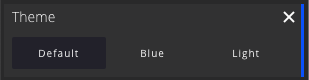
The theme module allows a user to set their preferred theme for the GUI, the selection is stored in the localStorage of the browser meaning that it will only be apply for a single machine.
An example of the currently available themes can be seen below
 Default theme |  Blue theme |  Light theme |
|---|
Stats

The stats (info) module is a handy tool for a developer to view various statistics and information of the current scene. Currently the stats module lists the following stats:
| Stat | Description |
|---|---|
| FPS | Frames-per-second shows how many frames the viewer can render at the current time. NOTE: The FPS can be limited by the browser/monitor |
| Resolution | Current rendering resolution of the canvas. By default the rendering resolution is not limited and equal to the size of the canvas but it can be controlled with the CanvasRenderingWidth and CanvasRenderingHeight properties |
| Camera | The name of the camera that's currently in use. Can be one of the following depending on the situation: mainCamera, sidescrollingCamera or cinematicCam |
| Position | World position of the currently active camera |
| Direction | View direction of the currently active camera |
| Visible labels | Currently visible labels within the scene, update on at least these labels will be handled whenever an UI update is needed |
| Total labels | Total number of labels within the scene, this number contains all the labels that are either hidden (by layout or due to belonging to a group) or are currently outside the camera frustum |
| Hovered mesh | Name of the mesh that's currently under the pointer or None |
| Selected mesh position | World position of the currently selected mesh |
| Memory | Current javascript heap usage |
Zone Profiler
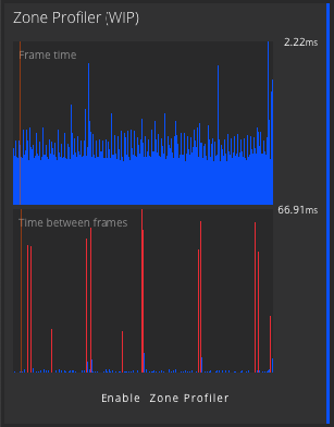
The Zone Profiler module can be used to record and spot performance issues and other long running tasks within the viewer or even outside of it. The module is only available when the DebugMode is enabled and will record up to 240 frames worth of data.
In the image above, we can see that the viewer's taken a most 2.22ms to update within the last 240 frames, where as something between the frames (viewer updates) has taken up to ~67ms. In this example, the long running task was executing a heavyish ThingWorx service every second
The zone profiler is still a work in progress and can currently only be used to visualise the frame times
Usage Example
In the following example we will start by having a look at the example mashup that is included in the Elisa3DViewerModel_ExtensionPackage and continue by recreating some of that functionality to a fresh mashup.
In this documentation, we will only look at Elisa3DViewer.Mashup.Example1. Other examples might demostrate different capabilities of 3DV. Make sure to check them out as well!
Example 2 - Moving objects example
Let's start by having a look at the example mashup named Elisa3DViewer.Mashup.Example1 and viewing it

You should be presented with a view similar to this

Immediately the view presents you with some of the basic features of the 3d viewer:
- It shows the default Modules (GUI) on the left (1)
- Two different types of labels; a single collapsed label (2) and a collapsed group label (3)
- Two of the assets are displaying (abnormal) states (4)
- Three geo fences (5)
Navigating the viewer
If you move your cursor around the scene, you can see some of the assets within the model displaying a highlight around them during hover. This means that the hovered asset is selectable, allowing you to define a view (or a focus point) for that specific asset. When an asset has a focus point defined, selecting that asset will transition the camera to the predefined view thus showing the asset from a point-of-view of your choosing.
Selecting such an asset and transitioning to the new view will most likely move the focal point of the camera meaning that rotating around the whole scene might not work properly anymore. In such a case you can always click on the Home button to reset the view back to its initial position.
When you happen to hover either the lollipops (collapse labels) or the assets they're attached to, you can see label opened if it was collapsed. In the image below on the left you can see a single label displaying various dummy KPI's and information and on the right you can see a group label displaying states and titles of its sublabels. This kind of content for the group label is automatically generated when the labels are grouped, but you can also define your custom content for the group labels the same way as you would do for the normal labels. We will see how to do this later.
Hovering the group label also displays a rough bounding box that should contain all the assets that belong to that group.
 Hovering an asset will display a highlight around the asset and the attached label expanded |
|---|
Moving the camera
By default the 3d viewer uses an arc rotate camera (also known as orbit camera) which allows you to rotate the camera around a specified target. Controlling the camera is done using a mouse. Dragging the canvas with the primary mouse button will rotate the camera around its focal point. Dragging the canvas with the secondary mouse button will pan both the focal point and the camera. We will come back to this later when we build the mashup from scratch and use the debugging mode to visualise the focal point. Alternatively if you wish to present a scene somewhere without having to move the camera manually, it is possible to define waypoints for the camera and have it automatically fly through the waypoints displaying. The example mashup has predefined waypoints that will showcase the example model. You can enable this mode by clicking on the Flythrough button that's inside the Camera module in the left. After clicking on the Flythrough button the viewer will take over the camera and switch to a camera called Cinematic camera. When in mode, you can't control the camera but can still interact with everything as usual. To exit the flythrough mode, you can either click on the Home button or by selecting (double clicking on) an object that has a "focus point" defined. In the example scene all selectable assets have a defined focus point.
Selecting an object
There are three ways to select an object:
- By double clicking on the actual asset
- By double clicking on an attached label (if one exists)
- By setting the SelectedObjectID property
When you select an object, its name appears in the Scene modules object field (1). If the object belongs to a group, the group will also be selected and shown in the group field (2). While labels can have different layout modes/states depending on whether they're hovered, belong to a group or anything, when the asset with a label is selected, that label will use the full layout mode (3) and appear on top of every other label no matter the distance. Should the object belong to a group, every object not belonging to the same group will be hidden if ShowOnlySelectedGroup is enabled (4).

Labels
One way to visualise data in the 3d view is the usage of labels. The 3d viewer has two different types of labels; regular and group labels. For the most part these two labels are the same, except a group label can only be created by assigning regular labels to a group. When a label belongs to a group, it will be hidden until either the group is selected or the asset its attached to is hovered. Grouping labels can help you organise parts of the scene into smaller logical sections. By default the contents of a group label is automatically generated and it will display the labels belonging to the group ordered by their state.

It is also possible to define custom content for a group label the same way as you would for a regular label. We will have a look at how to do this when we create the mashup from scratch.
The contents of a label consists of entities that we refer to as KPI's here (Key Performance Indicator) even if they are not necessarily KPI's. The list below shows the possible contents of a label
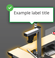
- Title of the label (1)
A label can consist of two titles, the regular one shown in the picture above and a collapsed title which is shown when the label is in its collapsed state, e.g. no KPI's/content is shown. - Progress KPI (2)
A progress kpi is a simple progress bar that consists of a title, value and min and max values. In the example - Key-Value KPI (3)
A simple key-value pair displaying a title and a value in text format - Custom Info KPI (4)
Any text without values, can be useful to display machine statuses or other messages - Speedbar KPI (5)
Speedbar is similar to the progress KPI but more expressive with its three possible ranges (red, orange, green). The ranges are defined using two limits. Also displays the title and value - Speedometer KPI (6)
Like speedbar except for its visual representation - State of the label (7)
The status icon can give a quick indication of whether everything's running normally or if there are any anomalies happening. The status icon is shown in all other states of a label except when it fully hidden

Building an example mashup
This example was built using ThingWorx 8.4.1-b2126 so your view(s) might look different depending on the version you are using.
Getting started
The easiest way to get familiar with everything is to just use the extension and do things with it. So let's create a simple mashup with some of the functionalities of the Elisa3DViewer.Mashup.Example1. Start off by creating a new mashup, we'll use a Responsive (Advanced) layout here and select Header Only template as we'll be placing some ThingWorx widgets there.
If you are running an older version of ThingWorx (the version here is 8.4.3) and the Responsive Advanced - Header Only is not available, you can always just create a normal responsive mashup and place a layout widget with a header row

Give the mashup a name of your choosing, click Save and enter Design mode.

Next up look for the Elisa 3D Viewer widget under the Widgets tab on and drag and drop it to the main area of the mashup container. When done right you should see the widget filling up the available space and a white logo in the middle as in the image below.

Now if you save and view the mashup, you should already see the viewer initialising a bit by first loading its scripts and finally stalling at "Waiting for scene". This means that everything's working as expected and the widget is waiting for a scene to display, we'll do that next by using the example dataset that's installed with the Elisa3DViewerModel_ExtensionPackage as an example to generate some data for the viewer.

Binding data to the widget
To get something showing in the viewer, we need to provide it with at least the scene to load. Currently the scene needs to be provided through a property update as the viewer doesn't check for hardcoded values in the SceneModelURL during startup. Let's continue by creating a new thing. Set the Base Thing Template to GenericThing and selected Elisa3DViewer.TShape.ViewerDataset as an implemented shape. After saving you can see that the ThingShape has provided our thing with some basic properties and services to get started.
There's no need to use the provided ThingShapes and other examples, but we'll do it here to make everything a bit easier

Click on the Properties and Alerts and look for the sceneUrl property. Edit the property and give it the following value /Thingworx/Common/extensions/{PACKAGE_NAME}/ui/Elisa3DViewer/models/PTC_Robot.babylon. This value is for the same model that is displayed in the example mashup we looked at earlier and the value can be found in the Elisa3DViewer.Dataset.Example1 thing. The {PACKAGE_NAME} part of the value is something that gets parsed by the viewer during runtime, allowing the examples to continue working properly even if changes were made to the name of the extension.
Switch back to the mashups' design view and click on the + icon on the right side under the Data tab to add a data binding to our dataset thing we just created. From the popup find your thing using the Search entities functionality. After selecting the entity just search for the GetProperties service and click on the little arrow to add the data binding to our mashup, also check the Mashup Loaded? checkbox to have the service execute after the mashup has been loaded, thus we don't need to trigger it ourselves. Click on Done and you should see the service listed in the container inside the Data tab.

Now we can actually get something to show up in the viewer when opened. Expand the GetProperties service and look for the sceneUrl property and drag and drop it on top of our widget in the mashup builder. This will prompt you with the properties you can connect the data to, look for the SceneModelUrl in the list and select it. If you've done everything correctly you should have connected the sceneUrl from the GetProperties service to the SceneModelUrl of the widget. You can also see this in the Connections tab at the bottom of the mashup builder. Now if we save and view the mashup, you should see the scene from the example mashup loading up without any labels or such things.
If you made any changes (added or removed) to the modules when looking at the example mashup, those settings should've been saved to your localStorage and the modules should show up how you left them. E.g. in the image below, Info and Heatmaps modules were added


Orbit camera and camera waypoints
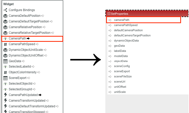
Before moving into the more ThingWorx related things, let's have a look at the orbit camera using the DebugMode and also how to specify and save waypoints for the camera flythrough. To do this we need to modify the mashup a little bit, by enabling the DebugMode we get a few more buttons to the Camera module (as seen in the module section). Set the DebugMode property to true. This will allow us to define the waypoints and test the functionality, but without connecting it back to ThingWorx, that data doesn't persist between users/sessions. Thus we'll add the SetProperties service to the previously bound Thing under the Data tab in the mashup. Then if you expand the SetProperties, the property cameraPath is what we need to bind our waypoint data to. The property from the widget is called CameraPath and you can drag and drop it to the cameraPath param in the SetProperties section. Again you can verify that the connection was made by checking the Connections tab at the bottom.
Now that the property is bound back to the thing, we still need to actually save it. This can be done by binding the CameraPathUpdated event from the widget to the SetProperties service, thus when the CameraPathUpdated event is triggered, the SetProperties will be called and it will update the cameraPath property from the widget's CameraPath property. This can be done either from the dropdown menu or by searching for the property in the sidepane. Finally to actually load the camera path back to the viewer, you need to connect the cameraPath property from GetProperties back to the CameraPath of the widget.


When loading the camera path back to the widget, you might notice that the debug visualisation of the path is missing. This can be caused by the path being set before the scene has loaded and the viewer disposing of all existing meshes before loading a new scene. In such a case the actual flythrough should still work but the debug view doesn't. To fix this, add another data binding to the Thing and call its GetProperties after the widget has triggered its ModelLoadDone event.

Now if we view the mashup, you should see the following additional buttons in the Camera module; Add Waypoint, Remove Waypoint and Save Waypoints so let's test it. Move the camera to a location and view that you want to see in your flythrough and click on the Add Waypoint button, then move the camera to another location and view and click on the Add waypoint button once more. Now you might notice something appear in the view that's partially blocking the view, this is the debug view of the camera path drawing itself allowing you to have a look at the flight path the camera will take when running the Flythrough mode. Add a few more points and zoom out to have a look at the generate path. If you click on the Flythrough button now, you should have your camera first move to the closest path point and start moving through the defined waypoints by following the white ribbon. Finally when you click on the Save Waypoints button, the viewer will generate a JSON string of the defined path, store it to the widget's CameraPath property and trigger the CameraPathUpdated event. If you've done all the connections described above, you should now be able to refresh the page and have your waypoint persist. You can also verify this by having a look at the cameraPath property from the thing itself.
The cones and white ribbon displaying the flight path are only visible when DebugMode is enabled
Let's have a quick look at how the DebugMode might help us understand how the camera works a bit better. If you have enabled the DebugMode and pan the camera to the side enough so that the focal point is not in the middle of the model, you should see a white sphere appear. This sphere is actually the focal point being visualised, now if you rotate the camera you should see that the camera rotates around the sphere and when you pan the camera, the focal point remains centered to the camera's view. When zooming closer to the sphere you notice that the zooming stops really close to the sphere as it doesn't allow the camera to move through the focal point. This point is always present with the orbit camera, even if not visualised, and acknowledging it might help you understand how to work with the camera. In the example mashup when you selected an asset and the camera was moved to a view where the asset was in focus, what actually happened was that the camera panned and rotated in such a way, that this focal point was approximately centered to the asset that we wanted to view.

Attaching labels
To display KPI's and other relevant information in the scene, we can create and attach labels to each asset in the scene. While still in the viewer, we need the name/id of the asset we want to attach a label to, so let's select any one of the assets by double clicking on it. This will display the needed ID in the Scene module. Here we've gone with the PTC_Robot_Station_2
Selectable assets display a highlight around them when hovered. Also a label can be attached to assets/meshes that are not selectable by default if you know their ID/name.

With the name of the asset let's open our DatasetExample thing and edit its LabelData property and from the popup click on Add to insert a new row in to the Infotable. From the popup let's fill in just the basics for now to get something showing. Pretty much all we need to get anything showing is the objectId and id, but only using the two would result in an error label so let's fill in the following fields for now:
- objectId - Name of the asset we looked up in previously
- id - Some unique identifier for the label, this can be used later to refer to this label
- title - Title text for the label, for now title is the only content we'll give to our label
- state - State of the label, let's set this to 0 for now and have a look at why in a bit. If we leave this empty, the label will get an error style
Everything else can be left as is.


Now to get the labels showing, we need to modify our mashup a bit and connect the LabelData to the widget. There's actually a service within the ViewerDatashape ThingShape we used to implement the thing called GetLabelData which we'll use. At this point you can connect the labelData property directly from GetProperties to the widget's LabelData, but we'll use the provided service as we'll be overriding some of its functionality in a bit. So add the service GetLabelData to the data binding and connect its AllRows output to the LabelData property of the widget. If you take a look at the label fieldname properties from the widget's property list, you should see that most all of them are automatically populated with the correct fields. If you're using your own DataShapes, you might need to configure the properties here to match your setting. Now let's also configure one property called LabelStyleStateFormatting, this will be used to set a correct state (style) for the label. To configure the formatting:
- Click on the State Formatting button next to the property name
- In the popup select State-based Formatting
- Set Dependent Field select to state (NOTE: For the fields to show up, you need to have connected something to LabelData)
- From the State Definition field search for Elisa3DViewer.States.Labels and select it
- This will list you all the possible states for our labels and their state values. Finally click on done
You can also play around with your own state definitions


If you had a look at the different state-value pairs in the definition, you might've noticed that state 0 is used for Not Configured which is what we can expect to see once we open the mashup as we defined the state of our first LabelData to be 0. Now save and view your mashup, if you've done everything right you should see a lollipop with the Not Configured icon on top of your selected asset and hovering it or the asset should display the label with its title showing.

Before we start looking at the other possible options for labels, let's make the mashup update the label data periodically so that we don't need to refresh the whole mashup whenever we make a change to the label data. To do this, add a Auto Refresh widget to the mashups header, make sure that AutoRefresh is enabled, set the RefreshInterval to something like 5 and connect the Refresh event to our Thing's GetLabelData service. This will make the GetLabelData service execute every 5 seconds thus updating the viewer with any updated label data. To test it out, save the mashup and view it again, now go to the DatasetThing's properties and edit the label data and set the state from 0 to 2. If everything's up and running correctly, you should see the state of the label switch from Not Configured to Running without needing to refresh the mashup runtime anymore. Now we can start adding more data to our label and see the updates being almost immediately reflected in the viewer.

Let's go back to editing the label data in our dataset thing; we skipped some of the properties at first so let's have a look at them;
- collapsedTitle - Is shown when the label is in a collapsed state but due to layouting, has its title shown. Set some value to this field to see it in action
- text - This field is here for or less just backwards compatibility, but in case you want to display a label with just some text, this might be the quickest field to do that.
- group - The group field allows us to group labels and assets, leave empty for now as we're only working with one label
- animationMode -
- layoutMode - Layout mode is used to control the initial layout of the label (e.g. when not selected or hovered). Possible options are
- 0 - Hidden, the label is hidden by default. Hovering/selecting the attached asset will display the label normally
- 1 - Collapsed, the label will only show its state (lollipop)
- 2 - Title, similar to collapsed but also shows the label's title when not hovered/selected. (NOTE: Using this layout will display the label's collapsedTitle or title, whichever is present in that order)
- 3 - Full, display all the label data even if not selected/hovered
- 4 - Reserved, currently the same as Full
- 5 - Default, will alternate between Collapsed and Title layouts based on the distance to the label. E.g. labels close enough to the camera will display the title, where as labels further away will only show the lollipop
- kpiData - Kpi data allows us to present various KPI's and other data in the label

For now let's just set some value to collapsedTitle, change the layoutMode to 2 (to see the effect of collapsedTitle and add some kpiData. To do this click on Add button next to the kpiData property. This will open up another popup with some more fields, before we fill in anything here's a list of the fields and what each one does:
- title - Title of the kpi, this should be present for all kpi types
- value - Value of the kpi is used for every kpi type except for Custom info
- type - The of the the kpi, the following types are supported:
- 0 - Custom info kpi will only display the title, useful for presenting asset status and other messages
- 1 - Key-value pair kpi will display the title and value next to each other in text format
- 2 - Progress kpi will display a progress bar from min to max with the value as progress (the bar clamps to min and max, e.g. doesn't overflow)
- 3 - Speedometer kpi displays the value in both text format and as a indicator in a speedometer. Speedometer also uses limits (and lowerLimit if defined) and can be inverted. By default the "good" values are before the limit is hit (e.g. the first half), to make higher values better tick the inverted checkbox
- 4 - Speedbar kpi is similar to speedometer but displays the value in a progress-like visual format. Speedbar also uses limits (and lowerLimit if defined) and can be inverted. By default the "good" values are before the limit is hit (e.g. the first half), to make higher values better tick the inverted checkbox
- min - Minimum value for the kpi, this is needed for kpi's that have a specific range (progress, speedometer and speedbar).
- max - Maximum value for the kpi, this is needed for kpi's that have a specific range (progress, speedometer and speedbar).
- limit - If there's a limit for the KPI, e.g. after (or before) which the kpi is considered to go from good to bad (or vice versa). Applies to speedometer and speedbar.
- lowerLimit - If there's a need for an intermediate stage, set a value for the lowerLimit, this will display a third state for the KPI's in yellow ("warning"). Applies to speedometer and speedbar.
- id - Used to identify the KPI.
- inverted - Whether the range should be inverted or not (e.g. values below limit should be considered bad). Applies to speedometer and speedbar.
- state - Similar to states for the label but for individual KPI's instead. Used to colour the title/value etc based on the state.
Fill in the kpiData with kpi's of your liking, for the example we'll create one or more of all KPI's to showcase them.

In the end, your kpiData might look something like this (NOTE: You can also construct the kpi data programmatically in a service or by querying connected assets)

Now if you save the labelData property and have a look at the mashup, you should see the KPI's appear in the label. You might notice that the text's for the KPI's are shown in red, this happened because we didn't specify state formatting for the KPI's and the returned state when the viewer queried it was an error style, in which the text colour is set to red. To fix this, let's open up our mashup builder and do the following:
- Under the GetLabelData service in the data bindings window, expand the AllData under Returned data and drag drop the kpiData to the widget and connect it to the KpiData property. NOTE: This binding is not actually used for connecting data, but rather to give the viewer a knowledge of the used DataShape so that we can configure the KPI fields and states properly
- If you're using the DataShape from the example, all the field name properties should be automatically configured. If not, you should look for properties starting with "kpi" and configure the field names to match your setup.
- Look for the widget's properties starting with "kpi" and configure the KpiStyleStateFormatting the same way as you did for the label. Now if you save and refresh your mashup, you should see the kpi's and their texts colored properly. (NOTE: You can only control the colour of the texts and the progress kpi using the states. By default the KPI's will use the Background color of their state, but this can be configured using the KpiFontColour field. If you don't do this, all the KPI texts will most likely show up with a dark grey colour and not necessarily reflect the actual state of the KPI.)
